




How the Chrysler Car Logo Changed Over Time
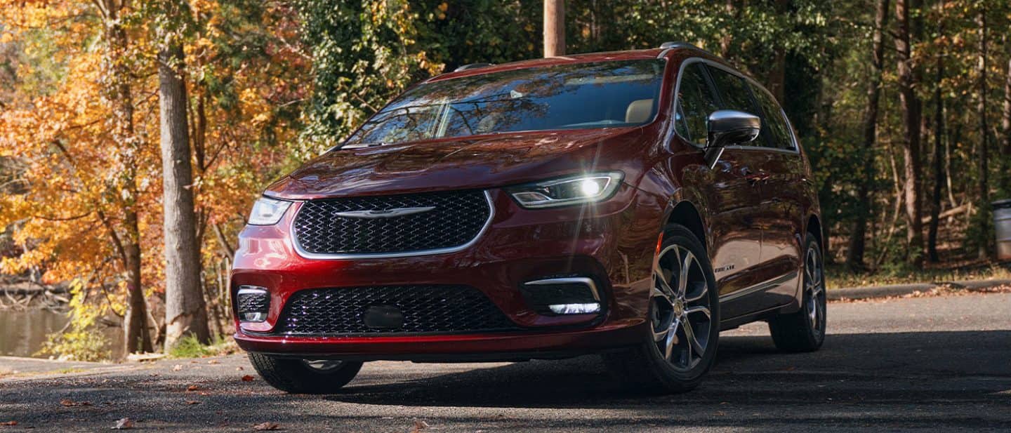
Photo Credit: Chrysler
History of the Chrysler Logo
The Chrysler logo has covered a lot of ground since the 1920s. Over the last century, the badging on a car’s grille has done a lot of heavy lifting for the brand—it tells drivers who made the car, but more importantly, it signals what the company stands for at that moment in time. Chrysler’s emblem has shifted repeatedly to keep up with changing tastes, new corporate owners, and evolving design trends. Looking back at how the badge has shifted gives you a surprisingly clear window into the story of American car culture itself.
Logo Origination
The story started back in 1924 with the launch of the very first Chrysler. Engineer Oliver Clark worked alongside founder Walter P. Chrysler to design a badging setup that felt official. They settled on a wax-seal design complete with a blue ribbon overlay—a literal mark of quality meant to assure buyers they were getting a dependable ride. Clark added golden wings spreading out from the central ribbon, drawing inspiration from Mercury, the Roman god of speed. Through the 1930s and ’40s, Chrysler kept tweaking this seal, sharpening the wing details and shifting the colors to lean into a sleeker, luxury feel.
Major Changes
By the 1950s, car design was moving fast, and Chrysler’s badging changed right along with it. They actually dropped the wings briefly in 1950 for a coat-of-arms crest with a lion, but that only lasted a year before they swapped it out for a stylized, 3D bird emblem in 1951. Then came the mid-’50s “Forward Look” era led by legendary designer Virgil Exner. Cars were taking inspiration from the Jet Age, so the badge pivoted to dynamic V-shaped wings and overlapping boomerang shapes that looked like they were moving fast even when parked.
Pentastar Introduction
In the fall of 1962, Chrysler rolled out what became one of the most famous logos in corporate history: the Pentastar. Designed by the firm Lippincott & Margulies, it was built using five simple triangles fitted inside a pentagon, creating a star in the negative space. The design team picked it out of more than 800 ideas because it was clean, recognizable, and didn’t rely on text. While you didn’t always see the Pentastar right on the front grille, it became the company’s master identity for decades—showing up on hood ornaments, keys, owner’s manuals, and dealership signs nationwide.
Switch to Typography
By the 1980s and ’90s, automotive branding started moving toward cleaner typography. Chrysler tried out several simple wordmarks before bringing back a modernized version of the classic winged seal in 1998. When Fiat Chrysler Automobiles took shape, the team streamlined things once more into the modern look we see on the road today. It features smooth, metallic wings stretching out from a deep blue central bar, with the Chrysler name written cleanly across the middle.
Experience the Legacy
When driving, spotting the Chrysler symbol at Chrysler Dodge Jeep Ram Fiat of Morgantown means you’re looking at nearly a century of automotive heritage. The dealership carries the full lineup of new and used models—whether you’re searching for a family-ready minivan or just keeping your current ride running smoothly with Mopar service. Stop by the lot to check out the Chrysler symbol up close and take a test drive.